Font guide
Premium Font Pairings: Editorial Edition
Three distinctive pairings to make your website feel more considered. Get the fonts, see the real examples and choose a starting weight.
Three font pairings from the editorial edition, plus the two extra examples in the opening. Start with the mood you want, open the real website, then get the fonts from their official publishers.
| Pairing | Use it for |
|---|---|
| Fraunces + Apfel Grotezk | Bold, playful portfolios |
| Source Serif Pro + BDO Grotesk | Structured editorial layouts |
| Zodiak + Switzer | Quiet, refined headings |
1. Bold and playful: Fraunces + Apfel Grotezk
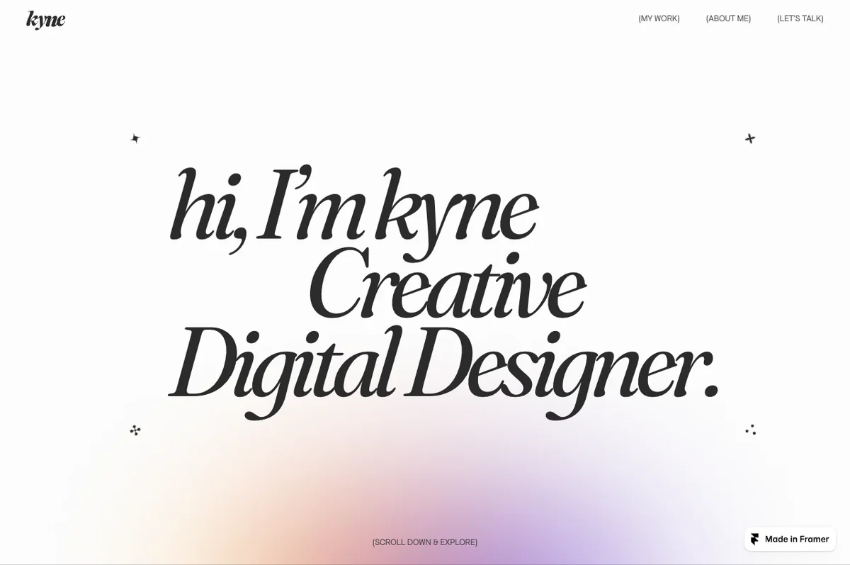
Let the heavy italic do the attention-grabbing. Keep the supporting font simple so the page is still easy to scan. In the Kyne example, start with Fraunces Black Italic (900) for the headline and Apfel Grotezk Regular (400) for supporting copy.
- Get FrauncesGoogle Fonts
- Get Apfel GrotezkCollletttivo
- Explore KyneLive website example
Both fonts use the SIL Open Font License. Fraunces source and license · Apfel Grotezk licensing.
2. Structured and editorial: Source Serif Pro + BDO Grotesk
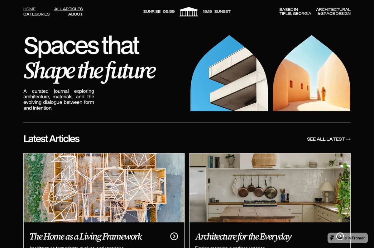
Use the sans serif to establish structure, then introduce a short italic phrase for contrast. The Quoin pairing uses Source Serif Pro Semibold Italic (600) with BDO Grotesk Medium (500). You do not need to make every heading italic; one contrasting phrase can be enough.
- Get Source Serif ProAdobe’s official version 3.001 release
- Get BDO GroteskLokal Container
- Explore QuoinLive website example
Source Serif Pro is the older family used in this example. Adobe’s current family is Source Serif 4; use the older release above for a closer match. Both Source Serif and BDO Grotesk use the SIL Open Font License.
3. Refined and understated: Zodiak + Switzer
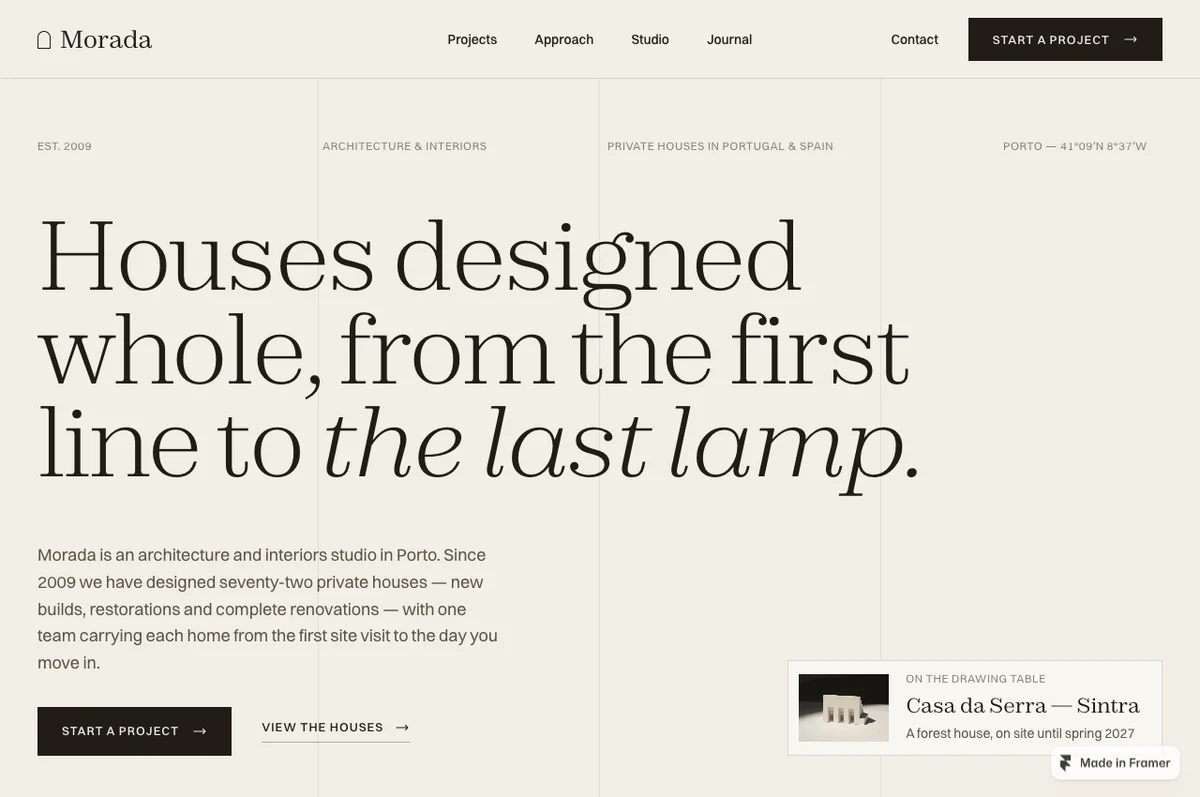
Give the serif room to breathe. Use Zodiak Light (300), with a short Light Italic phrase if it suits the heading, and Switzer Regular (400) or Medium (500) for smaller copy. Keep the light serif large enough to remain readable on a phone.
- Get ZodiakFontshare
- Get SwitzerFontshare
- Explore MoradaLive website example
Fontshare offers these fonts free for personal and commercial use under its ITF Free Font License. Download your own copy from Fontshare; its terms restrict modifying and redistributing the font files.
Two more examples from the opening
These appear in the five-site opening collage. They are bonus references, separate from the three pairings explained in this reel.
- Alive: Bodoni Moda + Hanken GroteskA high-contrast serif with clean sans-serif support
- Get Bodoni ModaGoogle Fonts, SIL Open Font License
- Get Hanken GroteskGoogle Fonts, SIL Open Font License
- Kiln: Newsreader + SatoshiAn editorial serif with a restrained sans serif
- Get NewsreaderGoogle Fonts, SIL Open Font License
- Get SatoshiFontshare, ITF Free Font License
Make the pairing work on your own site
- Give each font a job: one for expressive headings, the other for navigation and supporting text.
- Start with two or three weights. More font files and more styles rarely make the hierarchy clearer.
- Test your actual headline and paragraph copy at phone width. Check line breaks, small text and light strokes.
- Use the examples to study contrast, scale and spacing. The font download does not include the website template or its assets.
Official links and license sources checked on 27 October 2026. Fonts are linked to their publishers rather than bundled into a download. Website screenshots are shown as credited design references.